[<- back](../../index.html)
!!!
**Art of Frozen Synapse 2**
What follows is an art dump from the development of Frozen Synapse 2 and a Q&A with Alex Spencer conducted for Edge Magazine near the release of the game.


!!!
**Frozen Synapse Origins**
*You were lead artist on Frozen Synapse 2 and Cortex… but not the original Frozen Synapse, right? How does it feel stepping in at that point, especially on a project which has such a distinctive art style?*
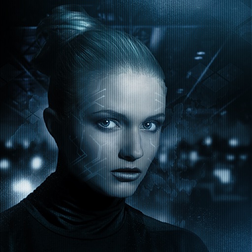
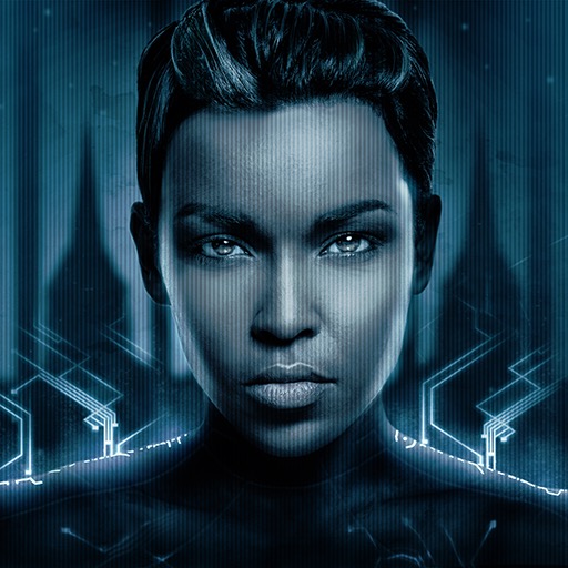
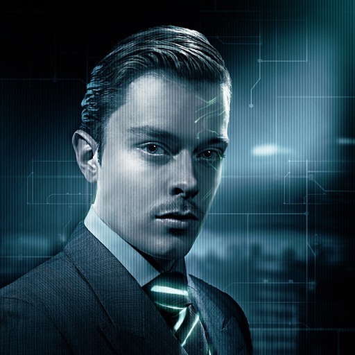
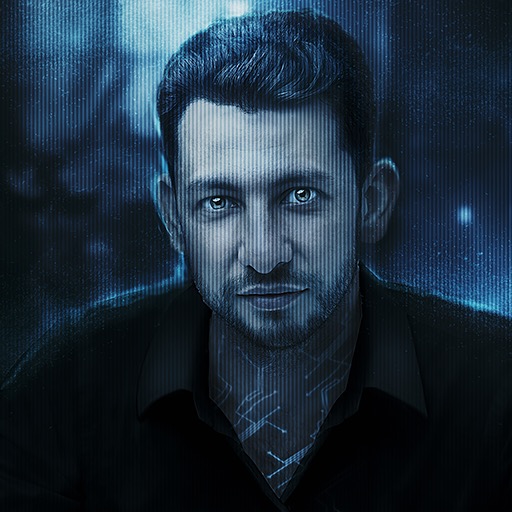
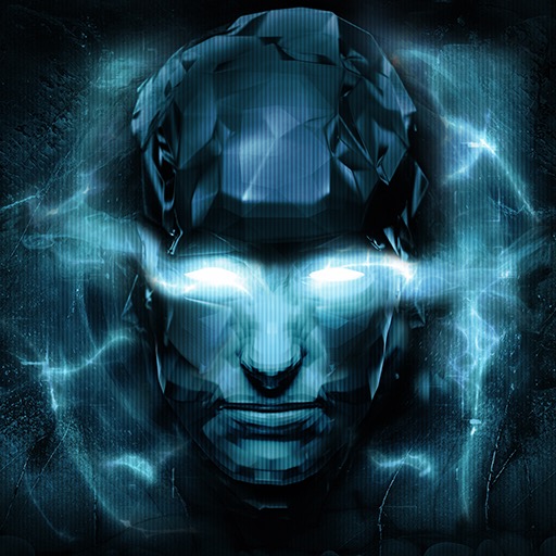
Frozen Synapse had a few of us involved in the overall look which I created in collaboration with Paul - the 'red concept' tested out quite a few ideas including the layering of the 'Real' world and the 'Shape' as photo based textures and abstract glowing overlays. Further iterations by other artists (including Rasmus Deguchi & Johan Lorentzon) pared this down to the minimal blue concept with green and red Shapeforms that defined the look of the original.
Quite a leap from the 'Wonky Triangle Wars' prototype. I also created some additional art in Frozen Synapse, such as the cutscenes, the character avatars and the world map. I was pretty familiar with the world!
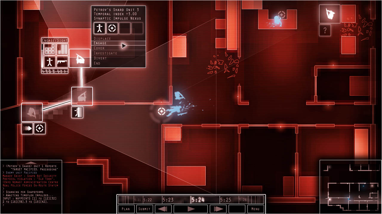
Once I was asked to create the art for a sequel Paul and I quickly settled on the foundation of the new look. The world of Markov Geist was in decay so the visuals should be dirtier, broken and analogue. We wanted to retain the familiar blue, the iconography of Frozen Synapse but also take advantage of better tech to generate more detailed levels featuring trees, foliage, water, curved walls and organic shapes. All on a larger scale. Oh and the entire city would also be generated of Frozen Synapse mission areas...this was a huge task but we didn't get onto the look of the city until later.
It took little time to settle on the look of the missions. They were created within the first month using the Unity Engine as a rapid iteration environment. I made an interactive realtime demo with tests for the scene, players, weapons, lighting, grading, special FX and audio. The first version only took 2 days. The remainder of the month was spent iterating and adding familiar icons. It helped that nervous_testpilot was already providing early music to help set the atmosphere.
*One of the first pieces created for the soundtrack by [nervous_testpilot](http://wwww.nervoustestpilot.co.uk). The Unity concept was aided by the addition of this as the mood and atmosphere defining soundtrack.*
!!!
**Frozen Cortex**
*How different was working on Frozen Synapse 2, compared to Frozen Cortex? Was there anything you learned on the first project that you were able to carry across?*
Cortex and Frozen Synapse 2 both use the same engine, [Torque3D](http://torque3d.org/), which certainly helped. However the styles were so different the art slate was almost wiped clean. The primary thing we learned from Cortex was to not set the bar quite so high for the visual fidelity of Synapse 2. Cortex had fully textured scenes and models with extensive animation, creating these was a huge undertaking for such a tiny team.
In retrospect it was wise to play to Frozen Synapse 2's conceptual strengths and always lean towards minimalism and abstraction, this is a lesson that kept coming back throughout development. Especially when we tried to add extra details or unnecessary layers. We also weren't fully aware of the scale the game would assume once the vast city was taken into account, restraining ourselves with the art prevented us from getting stuck in asset creation quicksand.
I still keep this in mind as a key consideration for all smaller scale games work, use the abstract nature of videogames to your advantage, help the player's imagination, avoid ruining it for them.
The weight of asset work in Cortex meant relatively little time was spent working in the actual engine. Most art time was spent in tools like Blender, Photoshop, World Machine and Quixel dDo. This is a total contrast to Frozen Synapse 2 which was extremely asset light, much of the visuals in both the missions and the city are generated procedurally by code. This meant lots of time switching between the engine and Sublime Text, refining inherited materials and TorqueScripts, testing generation of scenes and consulting with coders on the generation. A different skillset and development experience!
!!!
**Frozen Synapse 2**
!!!
**Evolving the Look**
*How did you evolve the look of Frozen Synapse for the sequel? And how do you balance that with staying true to what’s come before?*
The step from original to sequel was quite a large one that scaled quickly during the initial Unity concept. We pushed it hard with lots of glow, over the top FX, greater 3D depth, variety of shapes and detail to the mission view.
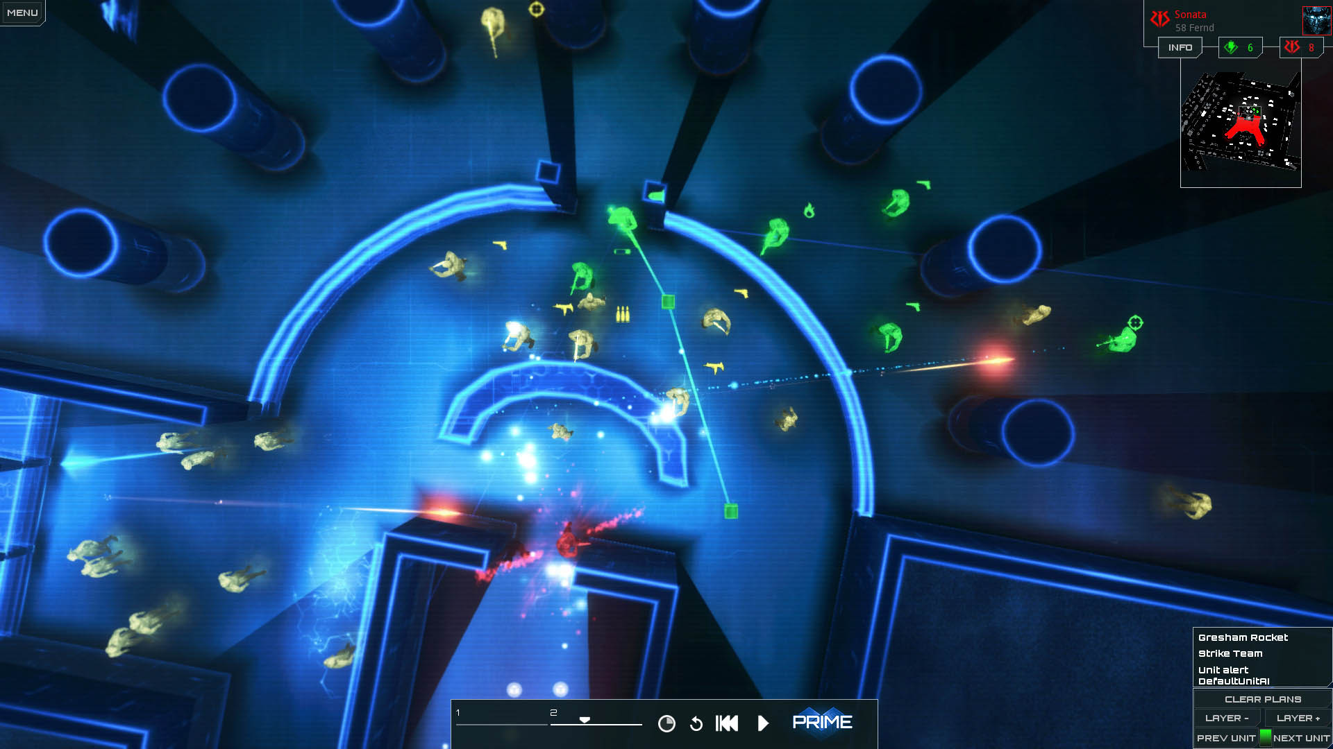
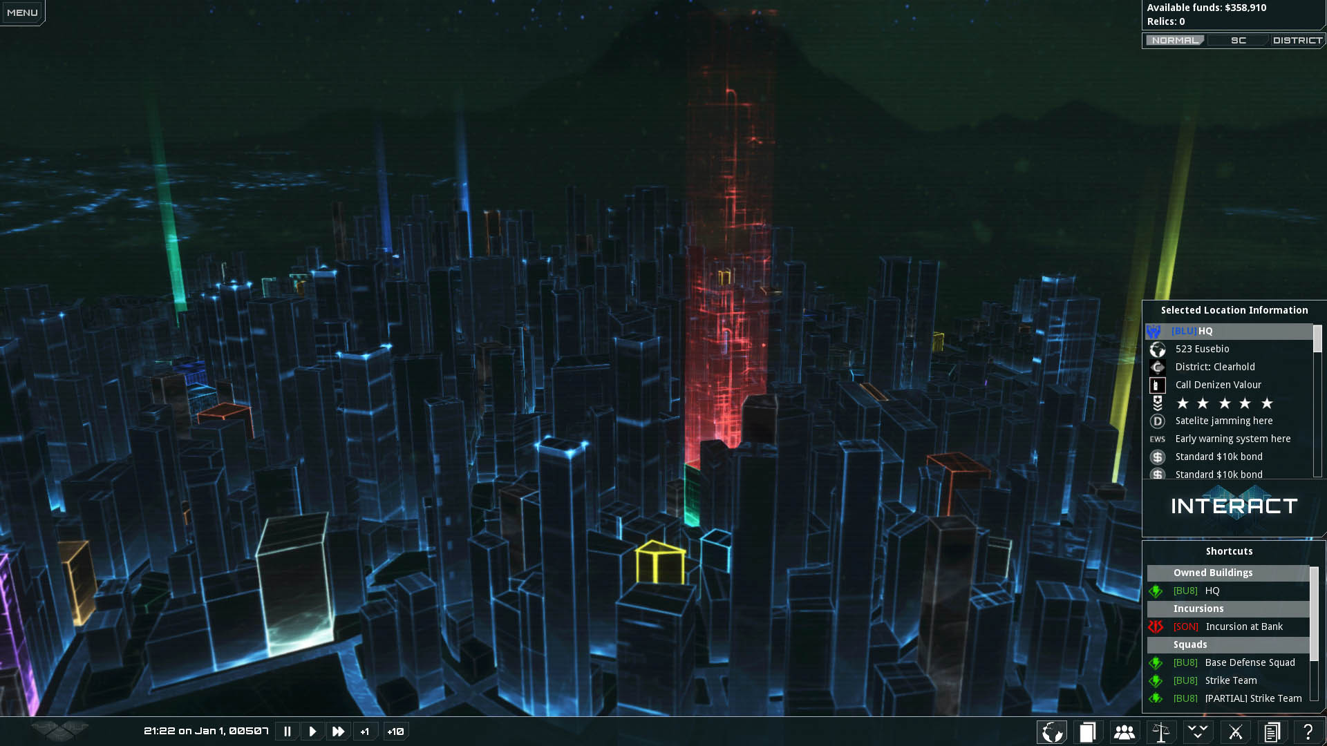
Once implementation had started in the Torque3D engine we then began to balance our initial ambitions against the realities of creating a complex tactics game. Technology wasn't really a problem, rather readability quickly became the dominant art pillar. This essential process of pushing and pulling in response to both internal and external feedback shifted the games visuals more in the direction of the original which also placed a priority on clarity.
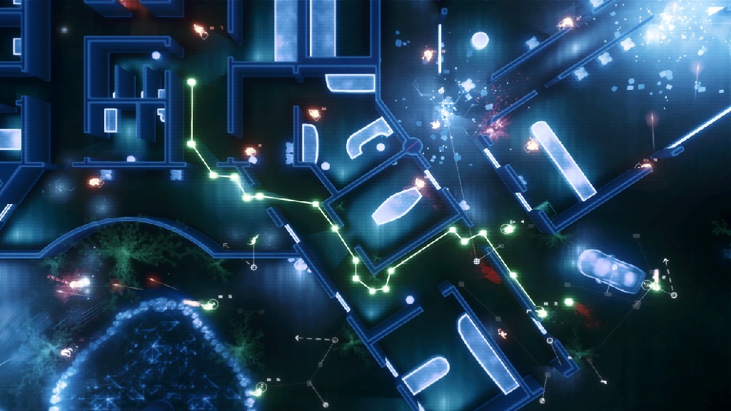
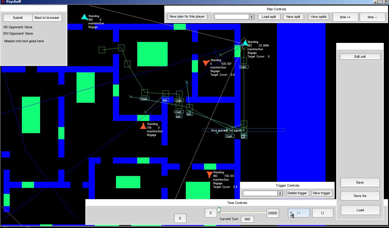
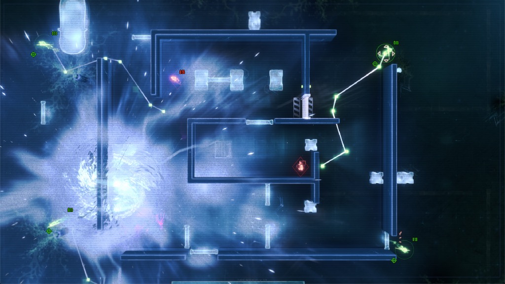
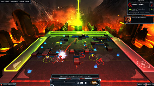
That didn't mean there weren't a number of refinements to make, there are far fewer lights in the sequel that cast potentially confusing shadows for instance. The missions are also far larger than the ones in the original, it took some time to maintain consistent readability at all scales. We also had to add a minimap to help players have an overview. Other additions include variety to the floors and room types, plus areas of the mission that are locked off, requiring a 'fog of war' which was also very hard to slot neatly into the visual hierarchy.

!!!
**Urban Planning**
*How much do you have to change your approach when working at the city scale art, as opposed to the smaller tactical battle stuff?*
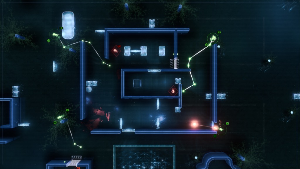
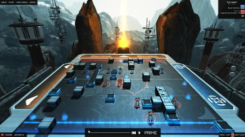
So, the art process for the city was the same as the missions, only more so! We were breaking new ground here. The city wasn't just ambitious in scale, we also wanted to tread a fuzzy line between board game-like perfect abstraction, with obvious places and tokens on one side, and on the other a Dwarf Fortress like scale that was initially hard to grasp. We vacillated pretty wildly around this line as we figured out how the city would look and function.
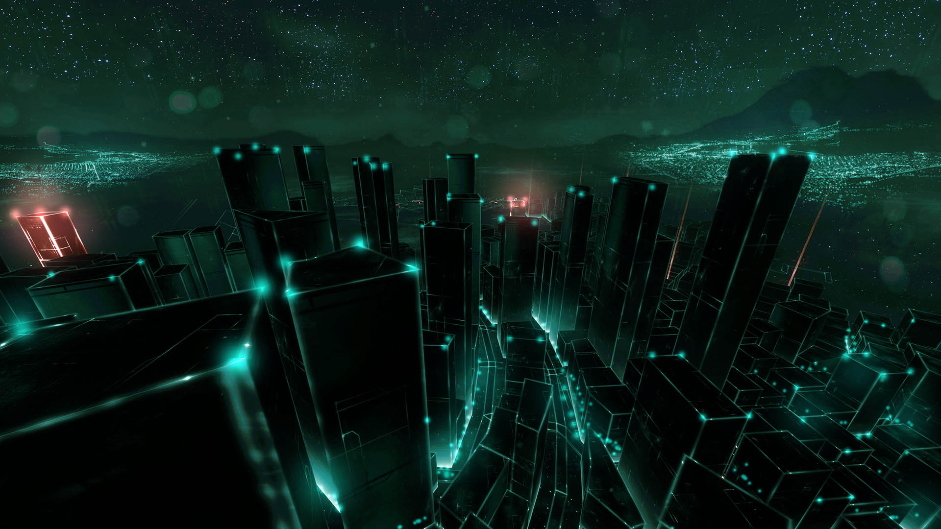
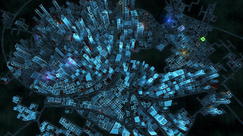
The tech is essentially identical to the missions, only the visual complexity had to be worked up in layers, both in terms of workflow process and literally, as you can enable layers in the city view. Trying to differentiate the regions of the city, the buildings status, the city districts, the factions controlled zones and the many squads making their manoeuvres was a real challenge.


!!!
**The Wireframe Method**
*Those almost wireframe-y Frozen Synapse visuals seem like they can do a lot with a little, technologically speaking. What are the advantages of working in this style? And are there any drawbacks?*
One drawback with a wirerame based look is a greater likelihood of aliasing, some of the key lines in the game dynamically scale in thickness based on the camera distance to help prevent this. We also had to balance the amount of transparent wireframe-y objects with opaque ones. Too many layers of wireframe is hard to read.
The primary advantage is the inherent abstraction. At multiple points we tried to shoehorn the concept of the 'Real' into the visuals. This would take the form of some kind of 'photo-real' looking element that was breaking through holes or cracks in the Shape. We abandoned this on the first attempt as it quickly sets you on a slippery slope of having to maintain the expectation of a coherent reality. Players know what a sidewalk looks like in real life, if you can use abstractions you no longer have to consider the procedural generation of totally realistic city streets, side walks and building interiors. That would have been a nightmare that was best avoided at all costs. This also applied to the floors of rooms later on, we set those to abstract patterns. The same problem was solved, the player could differentiate rooms and they had the freedom to fill in the gaps themselves!
!!!
**Frozen Synapse 2**
[<- back](../../index.html)